ShopDreamUp AI ArtDreamUp
Deviation Actions


![Velkss Ref NEW complete [2018]](https://images-wixmp-ed30a86b8c4ca887773594c2.wixmp.com/f/0c950904-ae9c-4f0b-b45b-05225f9926b2/d8k1ldx-87d89c9b-3233-4e09-9106-d70c5c9f3b58.png/v1/crop/w_184,h_184,x_0,y_22,scl_0.026285714285714,q_70,strp/velkss_ref_new_complete__2018__by_velkss_d8k1ldx-92s-2x.jpg?token=eyJ0eXAiOiJKV1QiLCJhbGciOiJIUzI1NiJ9.eyJzdWIiOiJ1cm46YXBwOjdlMGQxODg5ODIyNjQzNzNhNWYwZDQxNWVhMGQyNmUwIiwiaXNzIjoidXJuOmFwcDo3ZTBkMTg4OTgyMjY0MzczYTVmMGQ0MTVlYTBkMjZlMCIsIm9iaiI6W1t7ImhlaWdodCI6Ijw9MjM3MiIsInBhdGgiOiJcL2ZcLzBjOTUwOTA0LWFlOWMtNGYwYi1iNDViLTA1MjI1Zjk5MjZiMlwvZDhrMWxkeC04N2Q4OWM5Yi0zMjMzLTRlMDktOTEwNi1kNzBjNWM5ZjNiNTgucG5nIiwid2lkdGgiOiI8PTE2MDAifV1dLCJhdWQiOlsidXJuOnNlcnZpY2U6aW1hZ2Uub3BlcmF0aW9ucyJdfQ.MP4FjssGkkof6-6RppVqNafHSPRln8SRpVN7YnQNqQw)
![Velkss Ref NEW complete [2018]](https://images-wixmp-ed30a86b8c4ca887773594c2.wixmp.com/f/0c950904-ae9c-4f0b-b45b-05225f9926b2/d8k1ldx-87d89c9b-3233-4e09-9106-d70c5c9f3b58.png/v1/crop/w_92,h_92,x_0,y_11,scl_0.013142857142857,q_70,strp/velkss_ref_new_complete__2018__by_velkss_d8k1ldx-92s.jpg?token=eyJ0eXAiOiJKV1QiLCJhbGciOiJIUzI1NiJ9.eyJzdWIiOiJ1cm46YXBwOjdlMGQxODg5ODIyNjQzNzNhNWYwZDQxNWVhMGQyNmUwIiwiaXNzIjoidXJuOmFwcDo3ZTBkMTg4OTgyMjY0MzczYTVmMGQ0MTVlYTBkMjZlMCIsIm9iaiI6W1t7ImhlaWdodCI6Ijw9MjM3MiIsInBhdGgiOiJcL2ZcLzBjOTUwOTA0LWFlOWMtNGYwYi1iNDViLTA1MjI1Zjk5MjZiMlwvZDhrMWxkeC04N2Q4OWM5Yi0zMjMzLTRlMDktOTEwNi1kNzBjNWM5ZjNiNTgucG5nIiwid2lkdGgiOiI8PTE2MDAifV1dLCJhdWQiOlsidXJuOnNlcnZpY2U6aW1hZ2Uub3BlcmF0aW9ucyJdfQ.MP4FjssGkkof6-6RppVqNafHSPRln8SRpVN7YnQNqQw)


Description
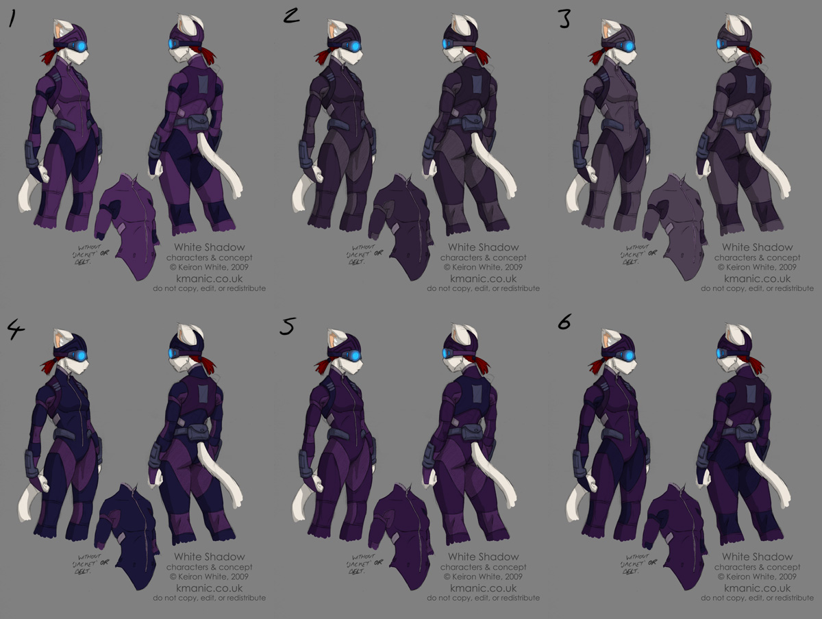
Yeah, yet more stuff to do with this suit.
I'm still trying to find the right balance of colours with this in terms of aesthetics and practicality. It's definately remaining purple, though it's whether I go with the newer palette or stick with the one from the previous suit design.
I'll give a rundown of my thoughts on each. It also helps to view these designs in greyscale to get an idea of the lower light conditions it's be seen in.
#1 - New palette
PROS: Fresh new colours; strong visual presence reads well in a comic; mixes well with fur and hair colours.
CONS: Colours may be a bit too strong; technically not very stealthy.
#2 - Old palette
PROS: Familiar colours; stealthy & muted colours.
CONS: Unsure if the colours sit right with design, slight saturation change?
#3 - Inverse old palette
PROS: Maintains familiar colours.
CONS: Too light, would be spotted easily even in low light; seems oddly militant.
#4 - Inverse new palette
PROS: Darker colours for lower profile; purple accents.
CONS: Majority is dark blue rather than purple; gloves (and boots) don't look right.
#5 - New palette, old configuration
PROS: A happy medium of tones; low profile yet strong colours.
CONS: Few, aside from the patch on the back of the jacket.
#6 - New palette, darker main colour
PROS: Hard to see in dark conditions.
CONS: Hard to see, period; can't make out details; makes the white fur stand out too much.
Any and all feedback is greatly appreciated. Cut loose! (Smile)")
I'm still trying to find the right balance of colours with this in terms of aesthetics and practicality. It's definately remaining purple, though it's whether I go with the newer palette or stick with the one from the previous suit design.
I'll give a rundown of my thoughts on each. It also helps to view these designs in greyscale to get an idea of the lower light conditions it's be seen in.
#1 - New palette
PROS: Fresh new colours; strong visual presence reads well in a comic; mixes well with fur and hair colours.
CONS: Colours may be a bit too strong; technically not very stealthy.
#2 - Old palette
PROS: Familiar colours; stealthy & muted colours.
CONS: Unsure if the colours sit right with design, slight saturation change?
#3 - Inverse old palette
PROS: Maintains familiar colours.
CONS: Too light, would be spotted easily even in low light; seems oddly militant.
#4 - Inverse new palette
PROS: Darker colours for lower profile; purple accents.
CONS: Majority is dark blue rather than purple; gloves (and boots) don't look right.
#5 - New palette, old configuration
PROS: A happy medium of tones; low profile yet strong colours.
CONS: Few, aside from the patch on the back of the jacket.
#6 - New palette, darker main colour
PROS: Hard to see in dark conditions.
CONS: Hard to see, period; can't make out details; makes the white fur stand out too much.
Any and all feedback is greatly appreciated. Cut loose!
Image size
1200x904px 230.95 KB
© 2009 - 2024 funkyalien
Comments50
Join the community to add your comment. Already a deviant? Log In
i'd say 1 or 2.. quite frankly.. a stealth suit is a dumb idea outside of Metal Gear Solid because it stands out like a sour thumb no matter what, this does not how ever.. diminish my love for the stealth suit one bit XD OR metal Gear Solid or Splinter Cell for that matter no.. saying that, she has white fur.. shes still not gonna be blending in.. shadows with white floating in them? also when it comes to sneaking.. style goes out the window really, it only happens as an accident when form follows design
all that crap being said, this is a comic book, any one who expects all total realisim in one of them can jump in front of a moving truck for all the sense they make.. i say go with what you like best and just make it work. Its amazing what the shadows can hide when the artist wills it to be.
all that crap being said, this is a comic book, any one who expects all total realisim in one of them can jump in front of a moving truck for all the sense they make.. i say go with what you like best and just make it work. Its amazing what the shadows can hide when the artist wills it to be.